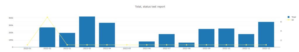
As an example, we will create a report in which we will graphically display the number of completed orders and the totals of those on a monthly basis.
Special requirement for the report will be the time period, the report should concern the year 2022.
To build the histogram, click on the second type of the report
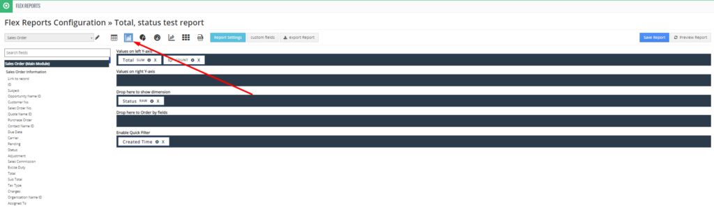
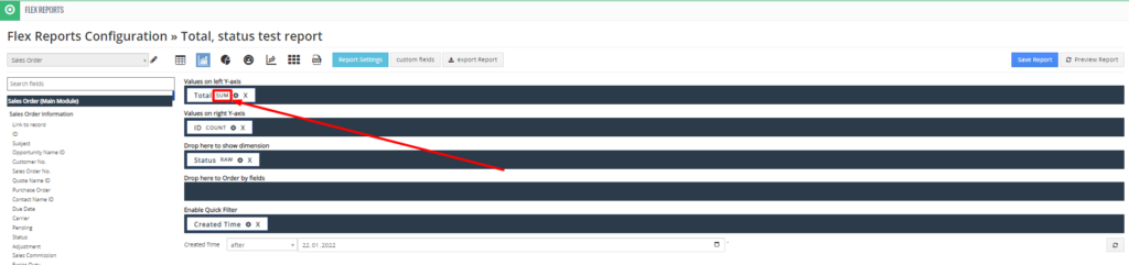
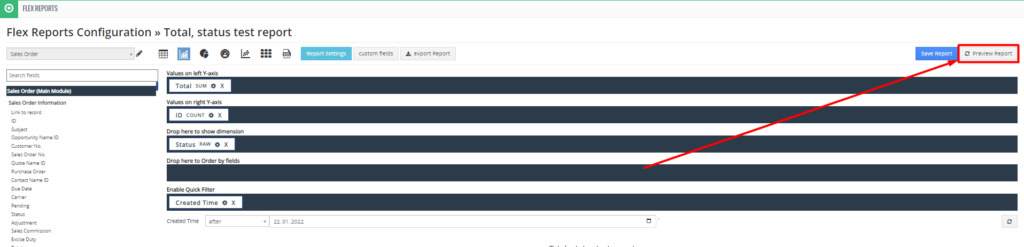
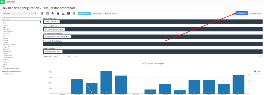
For the representation we use the following areas:
- Values on the left Y-axis
- Values on the right Y-axis
- Drop here to show the dimension
- Here you can sort by fields.
- Switch on quick filter
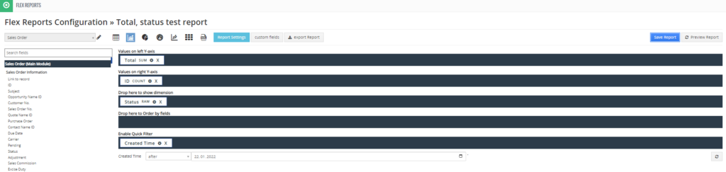
Drag the fields you want to evaluate to the right side in the appropriate areas so that you get the desired representation.
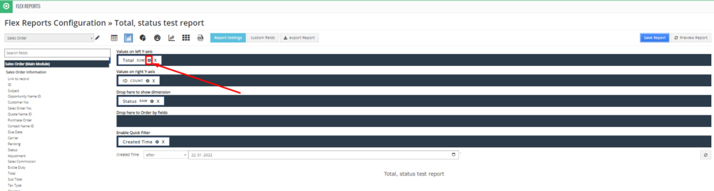
Um das Feld anzupassen, klicken Sie hier
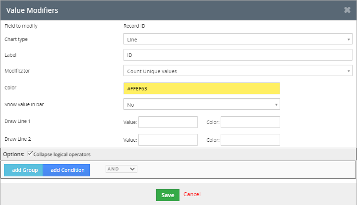
The value modifier consists of the following fields
- Field to be changed
- Diagram type
- Label
- Modifier
- Color
- Show value in bars
- Draw in line 1, draw in line 2
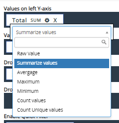
To change the field value, click here
A drop-down list with the following values is then displayed. Select an appropriate option.
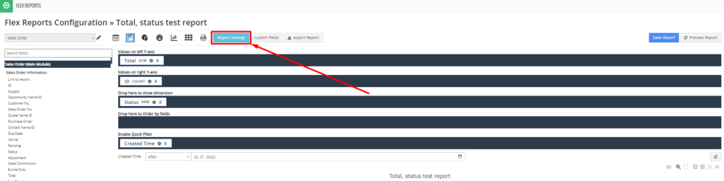
If you want to customize the report, click here
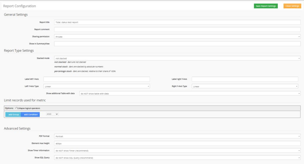
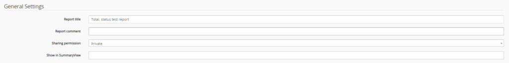
General settings
- Report title
- Comment on the report
- Permission to share
- Show in overview view
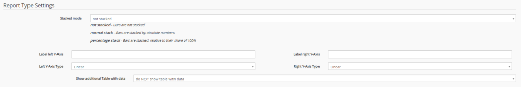
Report Type Settings
- Stacked mode
- Left Y-axis label
- Left Y-axis type
- Right Y-axis label
- Right Y-axis type
- Show additional table with data
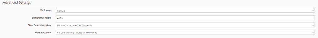
Advanced settings
- PDF format
- Element maximum height
- Show timer information
- Show SQL query
To preview your report click here
When you are satisfied with the created report and want to save it, click on “Save Report
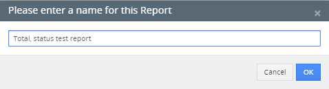
Then enter the name of the report and click “OK”.
Artikel-PDF herunterladen